Little Red Triangle

The #ds106 Daily Create for December 26, 2019: Abstractify: “Re-create a popular book cover by keeping the same words and text but changing the imagery into abstract art.”

Here is what I made:

Little Red Riding Hood book cover with a triangle for the hood, a circle for the face, a rectangle for the cape, and an oval for the basket

I stared with this cover image of Little Red Riding Hood from a Project Gutenberg version, posted on Wikimedia Commons.

Little Red Riding Hood original book cover with a drawing of a girl in a red hood holding a basket

I added that image to GIMP and used the “smudge” tool to smudge the colours. I tried various brushes and various settings to get something that still held a hint of what was there before, but was mostly a bunch of colours.

Then I added a couple of new layers for the shapes. For each shape I used the select tool to make the shape and then the bucket fill tool to fill the colour in the selection. I put the circle on a different layer than the red block and triangle so I could move it around more easily and place it where I wanted.

For the basket I used one of the brushes that comes with GIMP and used a dynamics setting I no longer remember (had to play around with that one a lot too).

In other news, for this I downloaded GIMP 2.10.14, which definitely works better with my OS than the 2.8 GIMP version I was using a couple of days ago!

The cat is king

The #ds106 Daily Create for December 24, 2019 was: Dress your pet up as royalty. Here is my cat Marco dressed as King Henry II.

Painting of a king with a golden crown, a golden necklace and a red robe, except the king's face is replaced by that of a tabby cat.

I used an image of a painting of Henry II from Wikimedia Commons, and this picture of my cat Marco:

A tabby cat sitting on a kitchen counter in front of a refrigerator

I used GIMP to create this image (version 2.8.18, which seemed kinda buggy, and I just now saw that I’m behind a couple of versions!).

I started by importing both images into GIMP as layers, and then I had to scale each layer up or down to make the cat’s face fit approximately into the space in the painting where King Henry II’s face was. As you can see, it didn’t fully work, because basically the robe is around Marco’s legs rather than his shoulders. But this is where I ended up landing.

Then, after some aligning and cropping, I added an alpha channel to the painting image and started using the eraser tool to let the cat image underneath come through. The tricky part was the whiskers, which I had to do one by one on the crappy little trackpad on my laptop, which is not conducive to drawing straight lines nicely.

I also ended up doing some erasing, and then realizing I wanted to resize the cat image more, and so then the erasing didn’t fit anymore, and then I had to start over (the above is about the fourth version or so). I think layer masks might have been my friend instead but honestly, it’s been so many years since I’ve used them that I can’t remember how to do so (and it was late last night when I was doing this and I decided not to try to re-learn at that point).

When I had the erasing looking pretty good I got this image:

Painting of a King with a golden crown and golden necklace, except the King's face is replaced by that of a tabby cat. The robe is further down the cat's legs than in the first version of this image above.

The robe was sitting too far below his shoulders and I didn’t like the way it looked. But the erasing was already done and I wasn’t going to do yet another version.

So I imported the original painting into the image on a new layer, and erased everything above the collar. Then I moved that layer up, effectively moving the collar and robe up on the image. It still looks like it’s sitting a bit low on him in the final version (top of this post), but I think it’s better.

I kept thinking that it was possible to do a selection on an image and copy the selection to a new layer (rather than adding a new layer and erasing everything around what I wanted), but again, I couldn’t remember at the time. Of course, all I needed to do was a web search to find the answer, and yes it’s possible, as this post from Logos by Nick shows.

Now to download GIMP 2.10 and see what has changed!

Burpees for Bobby

Greg McVerry asked ds106 participants to make something to promote a campaign called “Burpees for Bobby,” which helps out Greg’s nephew, baby Bobby, who has a type of leukodystrophy. Do a web search about it and you’ll weep as I did. You can donate to the cause, here.

I was looking around for drawings of burpees that were openly licensed so I could make an animation, but I couldn’t easily find any. So I made my own, modeled on a stick figure drawing I found on the web, but can’t now find anymore for some reason. I used the Paper 53 app to do it, then sent it to myself over email.

My burpee drawing
My burpee drawing on Paper 53 app

I opened the jpg and did screen shots of each of the parts to put them on separate layers in GIMP. I had to fiddle around with scaling the layers to get the stick figures to be approximately the same size–the heads and bodies of each one ended up different sizes when I did the screen shots.

Then I opened new white layers in GIMP and added the text layers to the beginning and end. To get the “GO!!” to flash, I just alternated the GO layers with blank white layers.

I repeated the burpee sequence 3 times, then gave my poor stick figure a rest for a little while, then started the animation over again.

The only tricky thing here was to get the timing of the animation right. I had to go back and figure out how to specify the duration of each layer in an animation by adding it to the layer name in milliseconds, such as shown in this screen shot:

Screen Shot 2014-08-25 at 11.24.20 PM

Here’s the finished product! The one thing I’d change if it weren’t late and I didn’t need to go to bed is that the jumping person doesn’t really look like they’re jumping but rather standing and raising their arms. Would need to raise that figure up a bit. But bed calls…

BurpeesForBobby

Mama and Boo Ghost at the aurora

MamaBooGhostAurora-June2014

I decided to combine the ds106 daily create for June 6, 2014: “Make a picture of yourself in a place you’ve always wanted to go but haven’t been yet” with my participation in the summer ds106 experience over at https://thebergerons.wordpress.com/

So here is the Boo Ghost and me as Mama Ghost at an aurora. I’ve always wanted to see an aurora borealis in person, but never have.

The background image of the aurora is by Omar Smith, and licensed CC-BY.

The process

In GIMP, I opened up both the aurora image linked above and an image of me and my son in Australia from September 2012. To cut us out of the original image I used the process described here, which involves using the “paths” tool–something I’ve never done before. In case that page disappears, here are the steps.


1. Click on the “paths” tool and go around the parts of the image you want to “cut out.” When you reach the first path marker, be sure to hold down the “control” button when you click that first marker to close the loop (although if I remember correctly, on my Mac the control button didn’t work and I think I had to use the “command” button, but my memory is fuzzy on this).

— Then you can move the anchor points around with the mouse to adjust where they are and adjust what is being outlined, which is nice.


2. In the window that has the layers in GIMP (see screenshot below), click on the little white button that looks like it has two sliders. You should be able to there choose “selection from path” (you can’t see it in the screenshot because I’ve already done it and I can’t recreate it…this is just to show the white “slider” button). This creates a selection from the path.

Screen Shot 2014-06-06 at 7.42.10 PM

3. Create an alpha channel–this means to give the image transparency, so when you cut out part of it you don’t get white space but a transparent space so the image underneath it will show through. Go to “layer” on the top menu and choose “transparency,” then “add alpha channel.”

— This step is really important for the part where I had to erase something (see step 5).


4. Now you need to cut out the background from what you’ve selected, so you need to invert the selection and cut out that part. Go to “select” on the top menu, then choose “invert.” Then you can just use control-x or command-x (for the Mac) to cut out the background. You should just have the piece you created a path around on a background that looks like a checkerboard (see top layer in screen shot above).


5. For mine, I still had part of the original image between myself and my son, between my left arm and his right arm. I needed to get rid of that, so I just used the “eraser” tool and erased it. What was underneath was just transparency, so the aurora image showed through. If I hadn’t added the alpha channel, when I erased part of the image I’d get a white space there.

— I also needed to erase around some of me and my son because there was a bit of the original image around the edges, which looked strange


6. I had to scale the layer (top menu: layer->scale layer) to make it a bit smaller, and then move it where I wanted.


7. Then the fun began with playing with the colours of the layer with me and my son. I just messed around with Colors->Curves until I got something that looked kind of ghosty. Then I reduced the opacity of that layer (with the slider on the top of the screenshot above) so we were kind of transparent. Finally, I used the “blur” tool to go around the outlines of me and my son so we didn’t have such sharp outlines. It made us blend into the background image a bit more.


8. I didn’t collapse the two layers into one (which you could do by right-clicking on the top layer (or control-clicking, on a Mac) and choosing “merge down), but left them separate in case I wanted to adjust the layer with me and my son more. Having it separate means you can adjust colours, etc. on that layer alone.


9. I then exported as a jpg and voila…


How I got the boo ghost into the GIFaChrome film

image

The past two weeks have been a blur. For the last two weeks of the Headless13 installment of ds106, several of us have been working together on a group project around a fictional camera called GIFaChrome.

How did this come about? While I was utterly swamped with work, I one day noticed a tweet or two referring to blog posts or G+ posts that had to do with something called “GIFaChrome.” Here is a page with a few Storify stories that explain how it all unfolded. The short story is that Rochelle Lockridge came up with the idea of putting an animated gif into a film frame and lots of people added in their ideas from there, including that there should be a camera that takes images and turns them into gifs (I think that was Mariana Funes’ idea). Then came the idea of putting glitched gifs into the frame, and so GLITCHaChrome was born (can’t recall the provenance of that one). John Johnston developed “LayerCake,” which allows for images to move OUT of the frame! There is also GIFaKidChrome, which makes animated gifs from the audio of children’s stories—that one was the product of spontaneous riffing on an image that originally came from a daily create assignment, a spot of riffing I was so sorry to miss but loved watching unfold.

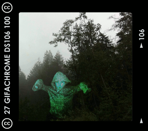
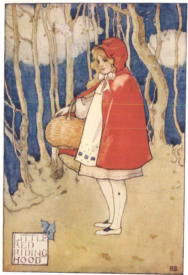
I’ll do another blog post soon reflecting further on this GIFaChrome project and the Headless 13 course as a whole. This post is dedicated to explaining how I did the gif at the top of this post. This was meant to be part of the GIFaChrome story, as a testimonial from a beta tester (see my previous post)

For a daily create earlier in the course we were asked to make an image of another ds106 participant as a ghost. I was trying to do one of someone else when my son heard about what I was doing and insisted he wanted to be in the picture. Thus, he is the ghost.

Making a gif from the original image

Here’s the image I started with, which I made in GIMP. Here’s a link to it on Flickr, in which I explained briefly how I made it. 

image

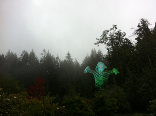
When I made this image in GIMP I had two separate layers, the one with my son as a ghost and the background forest layer. That made it easy to create a gif out of the image.

Before duplicating layers, I used the “blur” and “smudge” tools around the outside of the ghost layer so it didn’t look quite so “cut out” but more blended into the background a bit.

1. I first duplicated the image of my son as a ghost several times so I could have multiple layers to move around.

2. I wanted the ghost to “glow” a little, so what I did was select a layer, go to Color->Brightness-Contrast and played with the contrast a bit. Then I did the same only a little more for the next layer, and again for the next layer, then I started dialing it down gradually by the same amount for the next few layers so it would pulse a bit.

3. Then I moved each ghost layer a little bit to try to make the movement look smooth and somewhat ghost-like. At first I had the ghost move around in a circle, but my son nixed that: “Ghosts don’t move in circles, mommy. They move up and down.” Okay, so I started over and made it move up and down (and a little bit side to side too, even though that wasn’t what I intended at first). I had to keep making various layers visible and invisible (by clicking the “eye” icon next to them) so I could see how the ghost would move when it cycled through each layer. 

3. In GIMP, if you go to Filters->Animation->Playback you can see what the animated gif will look like. Except that if you just have a bunch of ghost layers and one background layer you’ll just see the ghosts move and then the flash of the background. To see the finished product as it would really look, I had to duplicate the background so I had as many background layers as ghost layers, and put a background layer under each ghost layer.

image

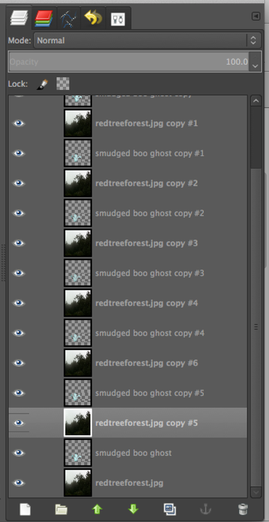
Then I had to control-click on each ghost layer and choose “merge down” so that each ghost layer merged with the background layer under it. Then, when going to Filters->Animation->Playback I could see what it would really look like.

5. The problem was that if I didn’t like the movement and wanted to re-do it, I was unable to do “undo” for enough times to get the layers unmerged. I was able to use “undo” for most of the layers, and then it just wouldn’t go back any further. So I’d have to close the file and start over, which kinda sucked because then I had to re-do the glow again from step 2. Boo.

6. Finally I had a nice looking gif, but the file was too big. So I first used the “crop” tool to crop the image to approximately a square, and then went to Image->Scale image to get it to about 450px x 450px.

Putting the GIFaChrome frame around the gif

Rochelle Lockridge provided a GIFaChrome template on her blog, which I downloaded. It was a photoshop file, but turns out that opened in GIMP just fine.

Here’s what I did to get my gif into the frame.

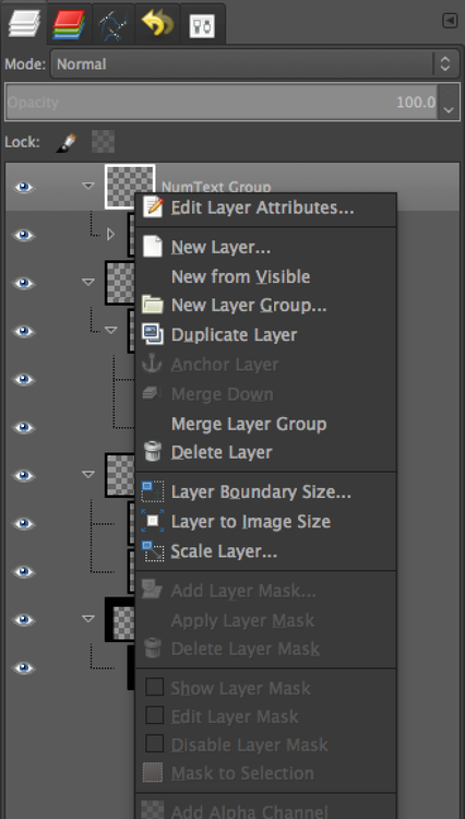
a. I first opened the GIFaChrome frame template in GIMP, and tried to use File->Open as layers to open up my GIMP xcf file with the gif I had just made. But what it kept doing was opening it up in one of the “layer groups” in the template file, which wasn’t going to work for animation. The screenshot below shows the various layer groups in the template files.

image

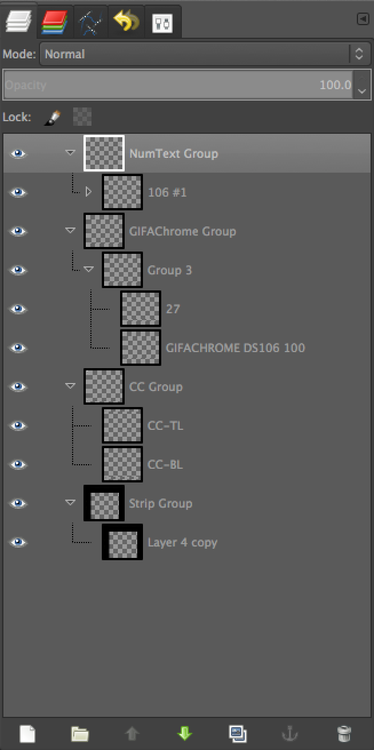
I realized I’d have to somehow get these groups into one layer so I could copy that layer and put it above each of the layers in my animated gif. 

b. I discovered how to do this. First, I control-clicked on the top layer in one of the layer groups and chose “Merge layer group,” which put all the parts of the layer group into one layer.

image

That gave me four layers instead of four layer groups. Then I had to get all those layers into one layer so I could duplicate the whole thing easily. I just control-clicked on each layer and chose “merge down” until I had one layer.

c. Then when I did File->Open as layers and opened the GIMP xcf file with my ghost gif in it, it simply opened all those layers onto new layers, not in any layer group. Perfect! 

d. Of course, the frame layer was not the right size for my animated gif layers, so I had to scale the frame layer down so it would fit.

e. I duplicated the frame layer enough times to put one above each gif layer, and then used control-click on each frame layer and chose “merge down” (just as in step 3, above). Voila! I had layers that would animate as a gif just fine. 

On the GIFaChrome website, this gif has sound attached, I think through the way John Johnston explains here. I don’t think I can do this on Tumblr, though maybe through the “html” function it would work. At any rate, it’s his own voice to go along with the image!

Headline Mashup Visual

Vader-JarJar-Selfie
ds106 dailycreate for December 5, 2013: “Create a visual that might accompany one of the mashed up headlines from @twoheadlines.”

The original tweet: https://twitter.com/TwoHeadlines/status/407970369447161856


So this is supposed to be Vader taking a selfie but it’s Jar Jar that appears as his own image instead of Vader, like Vader is actually Jar Jar. Now that I think about it later, though, it just looks like he’s watching Jar Jar on the ipad. D’oh. My idea was a little too complicated to come out well in a visual image. Oh well…it took me long enough to get this done at all I’m not going to go back and fix it now.


The process (in GIMP)


I got the Vader image from the GIF Fight tumblr from August 2013—I had remembered this image from last summer. You can see the cool gifs people made with this image on the GIF Fight tumblr arhive for Aug 2013.

I then got an image of an ipad from Flickr; it took awhile to find one that was in approximately the right angle. Here’s the one I used: “iPad car mount,” by Jan Hammershaug, licensed CC-BY.

Lastly I had to figure out what should be on the ipad screen. I tried to find a good Yoda image that was openly licensed, but no dice. So why not Jar Jar Binks? Here’s the image I used: “Jar Jar Binks at SGTTC2010,” by Parka, licensed CC-BY-SA.

I first put the ipad in Vader’s hand by scaling it to the right size and then selecting around it by going to Select->Float, then Layer->To New Layer to get the ipad onto a new layer. I then deleted the rest of that image with the ipad.

I got Vader’s finger in front of the ipad the same way: I selected around the finger, floated the selection, then put it on a new layer so I could put it in front of the ipad.

Then I selected around the original image that was inside the ipad frame, did Select->Float and then Layer->to new layer to get that image out of the ipad frame. I then deleted the new layer with the image that was originally inside the ipad frame.

Finally, I had to crop the Jar Jar image and scale it so it would be small enough to fit inside the ipad frame.

Now I had layers in this order:

1. finger

2. ipad frame

3. Jar jar

4. the rest of the vader image

But of course, the Jar Jar image wasn’t at the right angle to look like it was actually on the ipad. That’s when I discovered the “perspective” tool in GIMP, which lets you warp a layer so it takes on a new perspective. I played with this a bit, moving various corners various amounts to see what it looked like, until I got the perspective looking pretty good.

I also had to play around with scaling the Jar Jar layer so that it didn’t stick out the sides of the ipad frame but still fit within it. In the end I had to use the paintbrush tool to cover over some parts of the image that were a little too small for the frame and some of the background was showing through. But it works okay.

I’m amazed I got this to look pretty much like I pictured it when I thought of it.

This image is licensed CC-BY-SA: https://creativecommons.org/licenses/by-sa/3.0/