Number 2 as anvil

In the episode of The Prisoner called “Hammer into Anvil,” Number 2 pretty much loses it by the end. One part that really intrigued me was when he was shown towards the end stroking the penny farthing. I’ve seen some suggestions online about what the penny farthing is all about in the series, and in an interview McGoohan talks about the problems with progress…it seems to maybe have something to do with an ironic statement about the progress we have achieved (not much, really, despite our advances in technology). Maybe we haven’t progressed very far morally, for example.

So with that in mind, I find it very interesting that when Number 2 loses it he ends up stroking this ironic symbol of progress, as if he thinks it’s going to be his saviour. It’s what he believes in; it comforts him.

It’s also just a creepy sequence, as I tried to capture in this gif.

HammerIntoAnvil-ThePrisoner-long-fnl

the process

I made this in GIMP.

1. I used screencast-o-matic to do a screen capture of this part of the episode while it was playing on my computer.

2. I opened it in MPEG streamclip to capture just the frames I wanted, and then used “export other formats” and “as image sequence.” I exported to jpg with 8 frames per sec I think.

3. In GIMP, I had 32 layers, and I had to repeat some of them to get him to close his eyes again after he opens them. I just reversed those layers. So by the time I was done I had many, many layers, and I wanted to reduce the file size.

4. I cut out some of the layers, every other one, for part of the sequence. When I did it for all of it then parts were too choppy.

5. I resized the image to be 400px wide.

6. I tried changing the colour mode to “indexed” before saving, but that made the finished gif even bigger than it was before. Even when I set the max colours on indexed to 100!


So it’s 1.5 MB as is, which isn’t too bad.


And just for fun…

I created two more out of this sequence.

Eyes closed:


HammerIntoAnvilShorter


Now, just the eyes opening and closing:


HammerIntoAnvilEyes


GIFing A, B and C

For week 3 of #prisoner106, we were asked to do the “Animating The Prisoner” assignment.

I struggled with this one a lot for some unknown reason. I love making animated GIFs from video because technically, it’s pretty easy once you get the tools.

What I struggled with was finding sequences to animate from the episodes I’ve seen. I have a couple of ideas, but as this assignment is due in 1.5 hours, I figured I just do one so far and post it here.

In “A, B, and C,” Number 6 is drugged for two nights in a row and taken to a room where his dreams show up as videos on a screen, and they are manipulated from the outside to see if he was going to “sell out” (they wondered if maybe that’s why he retired). I was struck by the fact that there are two very similar sequences where the camera zooms in quickly on his wrist, where there are marks from the injections. In the first sequence, there is just one mark b/c it’s after the first night. After the second night, there are two.

I decided to animate these sequences to make it seem like it was just one mark, then he looks again and now it’s two, then he looks again and now it’s one, etc., etc.


OneMarkOrTwo-Prisoner106

The Process

I’m not sure I could explain it any better than is done in this great tutorial given here. I used MPEG Streamclip and GIMP as suggested in that tutorial, and used the settings given there.

I took a sequence of him sitting on his bed and then suddenly looking at his wrist and just duplicated it so it looks like he is doing the same motion but having different numbers of marks on his wrist every time he lifts it to see.

I keep getting a little frustrated at the pixelated colours on my gifs, but then discovered that the .gif format will only take about 256 colours, so there’s really not a lot you can do about this from what I can tell, when your source files have lots of colours and the gif will only have that many.

Jim Groom ransom gif

Jim Groom is an [edu] PUNK!!

Talky Tina has Jim Groom held hostage for RANSOM! And the ransom is that we need to make animated gifs of Mr. Jim Groom. We had until midnight. Well, it is 11:34 my time and so I think that counts, right?

Super true friend, please let him go? I see that he is still in his hut overnight, but hopefully he will be released in the morning.


Process!

I made this gif in GIMP.

1. I copied the original image, which had “edupunk” on his hands, a few times on different layers and labeled them “edupunk” for ease of reference later.

2. Then I took one of those layers and, using the “clone” tool, got rid of the “punk” so I just had “edu.” I saved that layer as “edu.”

3. Then I got rid of the “u” in “edu” using the clone tool, and saved that layer as “ed.” Same for eliminating the “d” and ended up with just an “E” layer. Then I erased the “E” and ended up with a “blank” layer.

4. I then had to order the layers and specify the time delay between them. I started with the blank layer, then used the “E” layer, then the “Ed” layer, then the “Edu” layer, then “edupunk.” I alternated the “Edu” and “edupunk” layers to get the “blinking” effect, ending with an “edupunk” layer. The part I spent the longest on was specifying the delay between layers to get the effect I wanted. You can see what I chose in the screenshot below (it is just missing the very last “edupunk” layer, which was 600ms).

Screen Shot 2015-03-14 at 11.46.23 PM

6. Then I had a heck of a time because though the delay was right when I used “filter,” “animation,” “playback” in the GIMP menu, when I exported the file to a gif file it just gave the same delay to all the frames (looked like about 100 ms). After some web searching, and having been fooled by a tutorial on time delays that told me otherwise, I found that what I had done wrong was put a space between the number and the “ms”, like: (600 ms). Wrong. Need to take out the space and then it works!

Ahhhhhh! The hand! The hand!

Ahhhhhh! The hand! The hand!

This is for August Animated GIF challenge #10: Monster Chiller Horror Theatre 3D style GIF. It is also a new animated GIF assignment on ds106. The idea is to find a 3D style movie scene and somehow

find your own way to emphasize the moving of a thing out of the screen and into your face in a GIF.

I found this scene from a 3D Dracula movie trailer on YouTube.

I wanted to try to emphasize the hand moving out of the screen somehow, and came up with the idea of selectively colourizing it. I discovered that if I selected the hand with the lasso, or free select tool, and then inverted the selection (so everything but the hand was selected), then I could go to Colors -> Desaturate, and it would make what was selected b/w (everything but the hand) but not what was unselected (the hand).

I did a few layers that way, but then realized that what would be really cool is if it started off in full colour and gradually went to b/w except for the hand…like the hand was really coming out at you while the background was fading into, well, the background.

So for the layers that would be first in the gif, I kept the first two full colour, and then gradually desaturated the next few: 20%, 40%, 60%, 80%, then one at 90% b/c I wanted another step there. How I did this was to free select around the hand, invert the selection, then use Colors -> Hue-Saturation, and chose the amount of desaturation for each layer. Then the last layers of the gif were full desaturation.

What took the longest, of course, was doing the lasso/free select tool around the hand on each layer. There were a couple of layers where the hand didn’t move very much, so I could keep the selection from one layer and use that for the next layer too, for desaturation purposes. But for most of the layers (12 total, 10 desaturated to some degree) I had to do a new free select around the hand each time.

I actually started off with twice as many layers as I ended up with, and deleted every other layer to end up with half as many. That saved a lot of time, and made the gif file smaller. Desaturating most of the image made the gif file smaller too.

I realized too late that I wanted to have more of the full colour and gradual desaturation layers, so the desaturation was more gradual. But I’d have to re-do all the free selecting to change the saturation level on any of the layers. So instead I just slowed down the first few layers by putting the time in milliseconds I wanted them to last after the layer name (e.g., “full colour (300 ms)”). Then when I exported as a GIF, I chose something like 200 ms for all the layers that weren’t otherwise specified for length. The first few layers go a bit slower than the last ones that way. It’s not quite the effect I wanted, but it’s close. If I were to do it over again I’d have more full colour layers, and do the desaturation more gradually, over more layers, with just a couple at the end fully desaturated.

Finally, I used a new trick I learned from Alan Levine’s comment on my last post, as well as Talky Tina’s reply on Twitter: dithering. When I was done with the layers, I went to Image -> Mode -> Indexed (because GIFs get indexed when exported anyway), and chose the fullest number of possible colours (256 for a GIF) and clicked the check box for dithering. I played around with several dithering options, and just used the first, which is called “Floyd-Steinberg (normal).” And I didn’t get the colour banding I’ve been getting on my other GIFs! Sure, the quality isn’t perfect, but it’s an animated GIF, after all.

I had a lot of fun with this one, even if it took me awhile to finish because of the hand lassoing of most of the layers!

And I think my favourite part is that—ha ha!—Dracula never gets to grab the woman. He keeps trying and trying and he never does it. A nice twist on the fact that these horror creatures continually attack women. Not this time. In your FACE Dracula!

Making Mr. Clown look very nice

August 2013 Animated GIF challenge #8 is “Add some flower power!”

The idea is to make something not so nice look nicer by adding some flowers.

Todd Conaway made this scary picture the other day, for a thank-you note to a childhood fantasy character.

image

I thought this one could use some serious flowering.

So I made this. I think it takes some of the creepy out of him by covering his eyes and mouth with flowers. Right?

image

This actually took me MUCH longer than I had expected. I’ll note that in another post, because I would like some  help with a particular question about why something I tried didn’t work.

What I did here:

I got the flower images from a site Talky Tina pointed to in her blog about this assignment: http://www.clker.com/search/flower/1

1. Duplicated flower images three times, adjusted opacity of each so 25%, 50%, 75%. Also played with the “layer mode” on GIMP of some of them to get funky colours (the two on the clown’s eyes).

2. Duplicated the original clown image to put under each of the first flower layers (the blue one on the left)—so a clown image under the 25% opacity of the flower, then one under the 50% and 75% opacities. Then merged down so had three layers of the clown image plus flower at different opacities. The idea of what I did is given in the screenshot below, even though it is for different flower layers. This is before merging down.

image

3. Duplicated three times the layer with the blue flower at 75% that had been merged with the clown image, and then put one of those under each of the next flower layers (the purple one at left, in 25, 50, 75% opacities). Merged down.

4. Repeat with other flower layers.

5. I duplicated the last flower layer (daisy on the clown’s mouth) several times, so the whole image with all the flowers would stay for a bit longer at the end. That worked fine until I “optimized animation for GIF” in GIMP (Filters->animation->optimize for GIF). I didn’t do that at first, but then the image was too big to animate on Tumblr. Seems it needs to be less than 1MB to animate. Optimizing it makes it MUCH smaller (this one is just over 140 KB), but it got rid of the duplicate layers at the end, so the image with all the flowers didn’t stay very long. What it did was add “combined” to each layer, though I don’t know what that means. So to fix this, I after optimizing I just duplicated the last layer a few times again. Worked like a charm.

6. I don’t like how GIMP has been making the GIFs look all pixelated. This is probably due to the optimization stuff, and/or the GIF format? Yes? No?

I wanted to have the flowers fade back out again like they faded in, but by the time I got this far, I had spent way more hours than I had planned, and decided this was good enough.

I tried what seemed to me a much easier way of doing this, but it wouldn’t work like I thought it should. Next post: please help me figure out why that didn’t work!

Scottlo going in circles in the desert

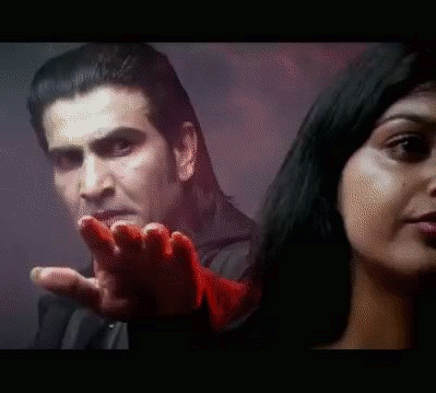
“Scottlo going in circles in the desert” by Christina Hendricks is licensed CC-BY-NC-SA Canada (the original car image is licensed as such).

The August GIF challenge for ds106 continues; this one is #5: reinvoke a missing ds106 friend! According to Talky Tina,

If you are missing a Friend from the DS106 Digital Storytelling Community, maybe you can re-invoke them into coming back with a voodoo Animated GIF Poster of your own!

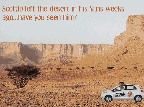
Talky Tina and I both did posters for our friend Scottlo, who left Saudi Arabia a number of weeks ago, and has been very quiet since. I know he got rid of his Yaris and doesn’t have it anymore, but that’s how I remember him—talking about driving his Yaris in the desert on ds106 radio.

And you know what? It worked! When I sent out a tweet last night asking for help with gifs, Scottlo replied! He’s around! Bill Smith said Talky Tina and I invoked him with our Art Makes. Wow, art is powerful.

The process

I used a still frame from Andrew Forgrave’s gif on this ds106 assignment for Scottlo’s Drive By show on ds106 radio. I then got this picture from Flickr, which is a place in Saudi Arabia that I have no idea if Scottlo ever visited (“Cliffs Near Faisal’s Pinnacle,” by Peter, licensed CC-BY).

I cut out the car from the background using the lasso tool, as well as a layer mask so only the car showed. I made numerous copies of the car.

I put the text on the background, saying “Scottlo left the desert in his Yaris weeks ago…have you seen him?”, and made lots of copies of that.

So then I just moved the car layers across the background layers so it looked like it was moving. I had lots of car layers at first, but was ending up with too many layers, so I made it jump across a bit faster.

The last layers were just a background with no car, and the text “Oh wait…he’s just going in circles.” So it would be just the background with that text, then the whole thing would start over. But it didn’t look right when the gif moved, so I decided to make a second pass of the car across the desert with that text on the background, so it would be like you notice he’s going in circles when he comes back around.

PROBLEM! I wanted the car to go back across the desert, but had already merged the car layers with the background layers, so couldn’t re-do the moving car without using the lasso tool on the original car image AGAIN. Okay, so I just use the first moving car layers over again. NO, because those have the wrong text on them (the first text about him leaving the desert), and I’ve already merged that text onto the layers.

Nothing to do but use the clone tool to “erase” the text on the moving car layers and replace it. I don’t know if I could have used the eraser tool…maybe.

LESSON TO ME: Don’t merge layers down until you know you are through. Of course, Rockylou told me another trick: save several versions, some without layers merged down, so you can go back and change stuff with the earlier versions if need be. I even said “yes, good idea,” and then I didn’t do it! Boo me. The problem is that you can’t really see what the gif is going to look like until you merge layers (unless you’re really good at this stuff and can just tell what the program is going to do!).

So yeah, I cloned the sky, and got rid of the original text, and put the “circles” text on the second go-around of the car. And of course I didn’t clone the same way on each frame, so you can tell that the color around the text changes. Also, I didn’t put the second text on enough of the moving car layers, so it doesn’t go for long enough. But if I try to add it to another layer now, it won’t be in the same place on the image (I duplicated the background with the new text, so it was always in the same place). So again, lesson to me!

And why the heck is the text so pixelated and not-nice looking? no clue.

I had a lot of fun with this one, and again, I’m learning more and more with each GIF!