I can read tv (2.0)

One of the assignments for design week for #prisoner106 was to do the “I can read movies” assignment.

I have tried this one before, when I first started doing DS106 back in 2013; this was one of the first things I did in GIMP (not the very first, but I wasn’t that used to GIMP before I tried it). It nearly killed me. I spent all week on that one assignment, and came out with something that only looked sort of like I wanted. The basic design was pretty right on, but it didn’t turn out how I wanted it to.

Here’s my first attempt at this assignment:

What I made in 2013
What I made in 2013

And here is the blog post detailing all my woes with it. So many woes there were.

I was really reluctant to do this assignment again, but realized I should get back on that horse and conquer it.

This time I decided to try using a texture layer to make the cover look more like paper. I got the idea from this tutorial about photoshop. I use GIMP, but the basic idea is the same. Then Kathy Onarheim suggested this video tutorial by a former DS106 participant. That one was really helpful because it brought me to see that I needed to put the texture layer on top of the other layers. I had it below the text and other image layers and the effect wasn’t as good.

So here is “I can read tv” 2.0.

This image is licensed CC BY-SA 4.0

I liked the point in this episode that it all hinged on the watch of the guy who was supposed to be in Poland (was it Poland?). Maybe it wasn’t a single hour off, but the saying at the bottom seems catchier with just “an hour.”

Overall I’m pretty happy with this one, much happier than with 1.0.

The process

This one only took me about half the time of the first one (so like 3 days instead of 7!). I learned from the first version that when you try to import images into GIMP and re-colour them, things don’t work out so well. That’s why the hand and glasses on 1.0 are so pixelated. So I didn’t even try that. Instead, I managed to get the black background at the bottom by using a particular layer mode for the texture layer, as explained below.

1. I started with a white background, and downloaded this set of paper textures. The author says you can do whatever the [bleep] you want with them. S/he just asks for a link to what you used them in. Which I’ll try to remember to do when this post is finished.

2. Images used:

3. Fonts used:

  • Like with 1.0, I used “Dream Orphanage” from dafont.com for the “I can read tv” logo. I also used it for the “Number” and “1/6” in the box, as well as the tagline at the bottom. I think I also used it for the “copyright” notice on the left.
  • For the title of the episode and the “The Prisoner Series” at the top, I used Mermaid from dafont.com.

4. The line and rectangle: I still am not terribly happy with these. They were too heavy in 1.0, and still too heavy in 2.0. I used the “rectangle” selection tool to create a selection and then fill it with the “bucket fill” tool. There’s probably a better way.

5. At first I just created the book cover with the paper background as is, so it looked like that background with the text and images. It felt a little like just a piece of paper rather than a book cover. So I took the advice in the video tutorial linked above and

  • desaturated the texture
  • played with different “modes” for that layer

The “difference” mode made the black background with the white image of the penny farthing. I liked that, but then had to change the colours of the text because they turned from red to a kind of teal colour. So I recoloured the text teal and then with the “difference” mode they turned red.

5. How I did the clock face:

  • opened as a layer
  • added alpha channel (right-click the layer, then “add alpha channel”) so it had a transparent background
  • selected around the clock face with the circle select tool (the clock face on that image isn’t a perfect circle, but it was pretty close), then used “selection -> invert” to select everything outside the clock face.
  • then I used “edit -> clear” to get rid of everything outside the clock face
  • scale layer and move to get it the right size and in the right place; I had to use the “eraser” tool to erase around some of the edges so that you could see the outside of the penny farthing wheel around the whole clock face (since it wasn’t a perfect circle to begin with)
  • “colorize” the layer teal so it turns red under the “difference” mode for the texture layer
  • change the opacity so you can sort of almost see the spokes of the penny farthing behind it

6. Now I had a purely black background, which looked something like this (this is an earlier version, which had the “public domain” icon in the place of the “copyright” icon, before I remembered I had to make this CC BY-SA b/c of the clock image).

ICanReadThePrisoner-black

But I decided I wanted it to have that off-white top like some of the original “I can read movies” images.

So I had to add some more complications. I just couldn’t leave well enough alone.

7. I added another layer of the paper texture and added an alpha channel (see step 5, above). Then I used the rectangle select tool to select just the part I wanted to have the off-white paper texture behind, and went to layer -> crop to selection. That meant I had a layer that looked like this:

Screen Shot 2015-07-25 at 10.48.34 PM

So just the top had the off-white paper texture. Then I had to move the text and line/rectangle layers above it so the paper texture wasn’t covering them.

8. I wanted to make the top, off-white section look more worn and dirty, so I used several grunge brushes I had downloaded for GIMP and played around with size, opacity, colour, etc. I also did some brushwork over the penny farthing b/c it was too white.

9. Lastly, some of the black section was too light, and I wanted it darker. Since it was on “difference” mode, I had to use my brushes with a white colour to get darker patches here and there.


#prisoner106 Week 3 summary

It’s an hour before our week 3 summary is due, I’m tired, and I didn’t do everything I was supposed to do this week. I wonder if they’ll turn off the electricity to my bungalow? Only allow me as much food as my meager credit units for this week can buy? Send me back to the hospital?

During my visit to the hospital last week I woke up and discovered some strange blue stripes on my legs. This week I found, on my phone, another strange image, this time even more disturbing:

IMG_1465 (1)

I’m rather concerned, to say the least. And what could those letters mean? Why are there three F’s and only one B?

Despite this disturbing discovery, I did manage to do a few things this week:

Daily Creates

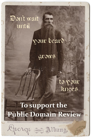
I made a poster for the Public Domain Review (daily create 1282, for July 13, 2015). After posting it as CC BY, I thought: silly me, why not post it CC0, which you can do on Flickr now? So I did.

Don't wait for your beard

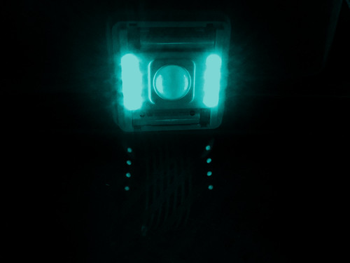
And I made an image with “magical light” (daily create 1283, for July 14, 2015)

Ghostly lights

Prisoner photo safari

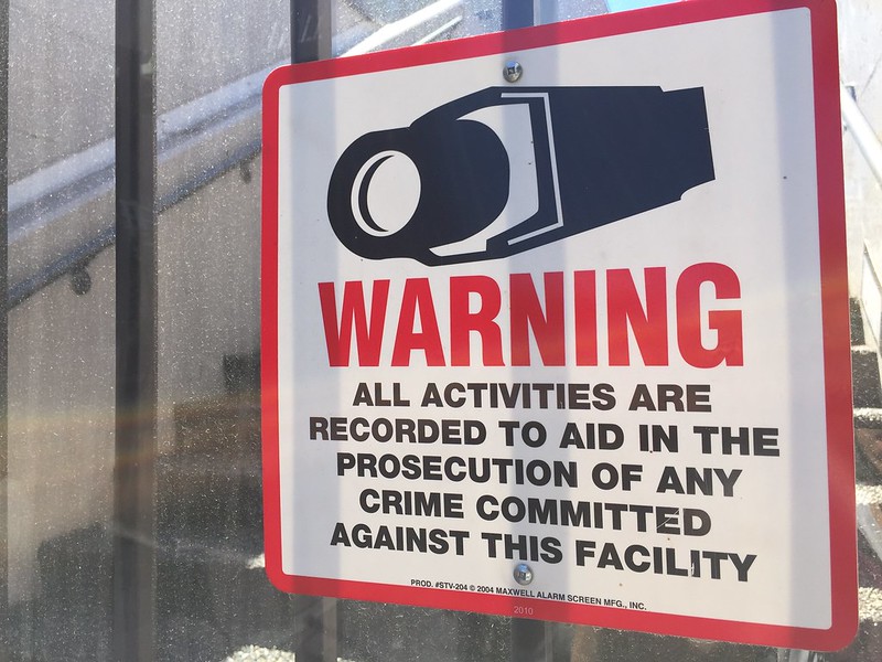
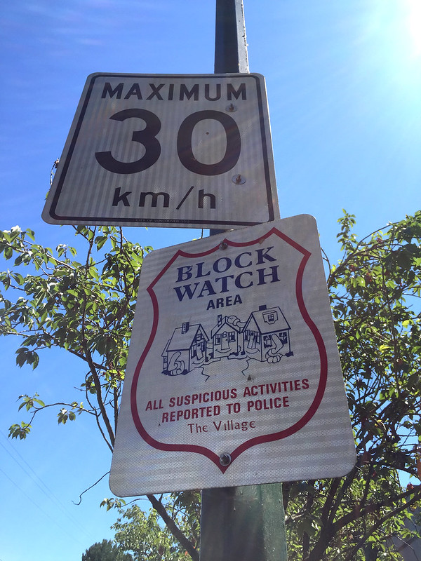
One of the visual assignments we were to do this week was a photo safari. Here are the photos I took while walking around The Village.

I got a little sneaky with a couple of these, and where it said “City of Vancouver” I changed it to “City of Village” or just, “The Village.” That was fun, but it’s kind of subtle (except on one where it’s pretty big).


Animating #Prisoner106

Though I plan to make more, so far I’ve done one animated gif of The Prisoner.


Now, it’s lights out in my bungalow. Will they come back on tomorrow?


GIFing A, B and C

For week 3 of #prisoner106, we were asked to do the “Animating The Prisoner” assignment.

I struggled with this one a lot for some unknown reason. I love making animated GIFs from video because technically, it’s pretty easy once you get the tools.

What I struggled with was finding sequences to animate from the episodes I’ve seen. I have a couple of ideas, but as this assignment is due in 1.5 hours, I figured I just do one so far and post it here.

In “A, B, and C,” Number 6 is drugged for two nights in a row and taken to a room where his dreams show up as videos on a screen, and they are manipulated from the outside to see if he was going to “sell out” (they wondered if maybe that’s why he retired). I was struck by the fact that there are two very similar sequences where the camera zooms in quickly on his wrist, where there are marks from the injections. In the first sequence, there is just one mark b/c it’s after the first night. After the second night, there are two.

I decided to animate these sequences to make it seem like it was just one mark, then he looks again and now it’s two, then he looks again and now it’s one, etc., etc.


OneMarkOrTwo-Prisoner106

The Process

I’m not sure I could explain it any better than is done in this great tutorial given here. I used MPEG Streamclip and GIMP as suggested in that tutorial, and used the settings given there.

I took a sequence of him sitting on his bed and then suddenly looking at his wrist and just duplicated it so it looks like he is doing the same motion but having different numbers of marks on his wrist every time he lifts it to see.

I keep getting a little frustrated at the pixelated colours on my gifs, but then discovered that the .gif format will only take about 256 colours, so there’s really not a lot you can do about this from what I can tell, when your source files have lots of colours and the gif will only have that many.

Prisoner photo safari

For week three of #prisoner106, one of the tasks was to do a photo safari that captures at least five of the following:

Screen Shot 2015-07-18 at 10.31.53 PMScreen Shot 2015-07-18 at 10.32.50 PM

Here is what I found on a walk through the Village today.

Authority and Imprisonment

This sign seems to capture both of these themes well. There is only local traffic in the Village, after all.

Road closed

surveillance

Village Block Watch


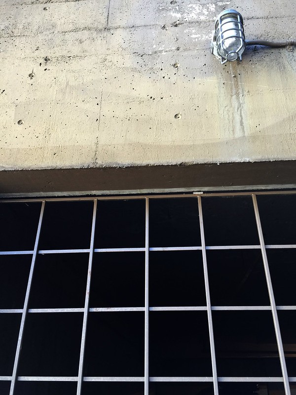
Imprisonment

barschained

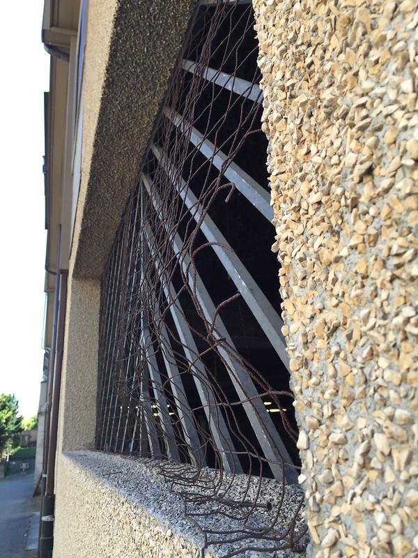
Freedom/liberty

broken wire

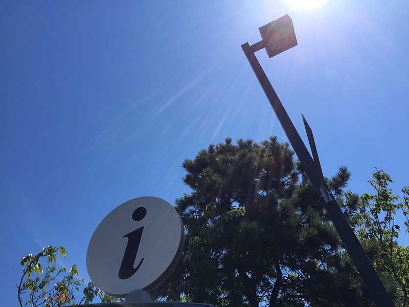
Information


Information

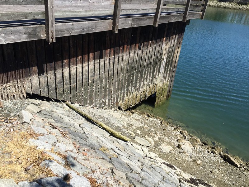
This image shows information about the tides…

Tidal information

I particularly like the information in this one.

blank

Rebellion

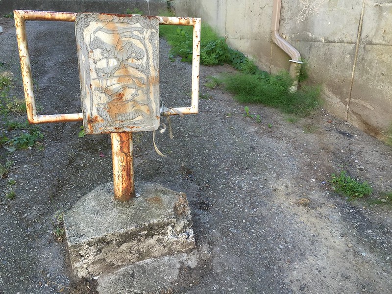
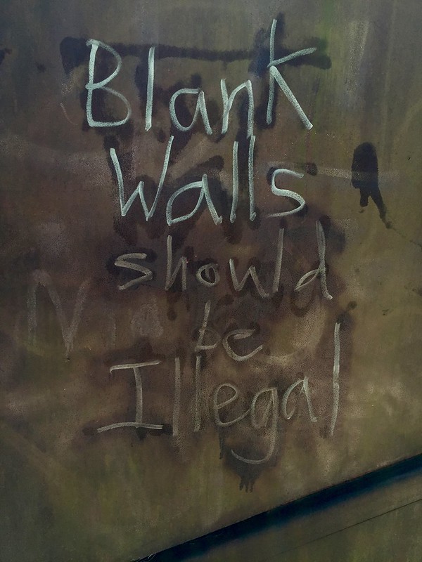
No blank walls

Here, the plants could care less about the orderly structure the fence is providing.

overgrowth

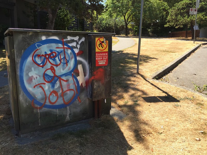
This one is sort of rebellious but really kinda not.

Get a job

Foiled escape attempt

So after my Village morning announcement, Rover came to help me. I was starting to, um, ask questions.

Questions are a burden to others. Answers are a prison for oneself.

That’s what I learned while I was in hospital. They treated me so nicely! Especially after, I am told, I tried to escape. I don’t remember it at all. But the nice doctors gave me an audio recording to let me know what I had tried to do, and what happened. They told me to keep it as a memento of my nice time in the hospital.

So now I’m back in my bungalow and can visit with you all again after several days away. Talky Tina made us some nice beverages so I’ll have to go visit her and share one. Sure could use a nice cold drink after that hospital food.


HaveADrinkWith_Christina
The delicious drink my Super True Friend Talky Tina made for me.


Credits

Many sounds were from freesound.org licensed CC0; the sound of me throwing off the wires from the heart monitor was made by me. The Rover sound came from the “Schizoid Man” episode. I recorded it using Soundflower like explained in the previous post.

Village Philosopher morning announcement

For audio week during #prisoner106, one of the assignments we were asked to do was to create a morning announcement for the Village like in The Prisoner.

Since I’m the Village Philosopher, mine had some philosophical content. Do you know the Ship of Theseus?


The process

I wanted this to sound like it was coming over a radio or through a loudspeaker, so I didn’t want a “clean” voice sound like I usually do. Time to use the crappy phone mic and speaker! I recorded the voice parts on some built-in recorder app on my phone (can’t remember what it was), and then I played that through the phone speaker while holding it near my laptop built in mic and recorded it into Audacity. Two crappy mics and one crappy speaker and voilà.

I wanted to do the same thing with the “technical difficulties” clip, but that would be a bit harder. I recorded that from my system audio using Soundflower. So it went straight into Audacity from there. I would have had to then record it on my phone from my laptop, then back into the laptop using the same procedure as above. I decided to just let that go and have it not sound like it was coming through the loudspeaker.

BTW, here are a couple of sites I found useful when I had to try to remember how to use Soundflower (I didn’t remember):

I recorded the Rover sound using Soundflower as well, while watching The Chimes of Big Ben on the Prisoner106 archive. I then uploaded that Rover sound into a #prisoner106 sound collection that Melanie Barker started, that we can all use and contribute to.

The Rover sound from that episode has music in parts of it, though, and I didn’t want the music, so I had to cut and paste parts of the Rover sequence into my audio file. I tried and tried to make the two parts fit together smoothly, but it just wasn’t working. So I gave up and there’s an obvious jump between parts of the Rover sequence. But hey…who said Rover’s noise had to be smooth?


Sounds

Mostly made by me, except:

Birds sound is licensed CC0 from freesound.org, but in case anyone wants to find it (or in case I want to find it again), here it is: http://freesound.org/people/sphion/sounds/158527/

Technical difficulties voice sound was made from here: http://onlinetonegenerator.com/voice-generator.html

The Village announcement chime came from the Prisoner106 archive.


Update:IMG_1439

At the end of this broadcast Rover got me, and I don’t remember anything until I woke up in the hospital. And I saw this. What could they possibly be doing to my legs?!