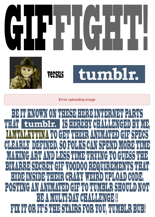
Tina versus Tumblr GIFFIGHT!
Yep. And double yep.

A digital storytelling blog
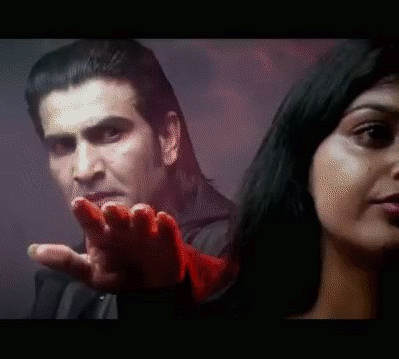
Ahhhhhh! The hand! The hand!
This is for August Animated GIF challenge #10: Monster Chiller Horror Theatre 3D style GIF. It is also a new animated GIF assignment on ds106. The idea is to find a 3D style movie scene and somehow
find your own way to emphasize the moving of a thing out of the screen and into your face in a GIF.
I found this scene from a 3D Dracula movie trailer on YouTube.
I wanted to try to emphasize the hand moving out of the screen somehow, and came up with the idea of selectively colourizing it. I discovered that if I selected the hand with the lasso, or free select tool, and then inverted the selection (so everything but the hand was selected), then I could go to Colors -> Desaturate, and it would make what was selected b/w (everything but the hand) but not what was unselected (the hand).
I did a few layers that way, but then realized that what would be really cool is if it started off in full colour and gradually went to b/w except for the hand…like the hand was really coming out at you while the background was fading into, well, the background.
So for the layers that would be first in the gif, I kept the first two full colour, and then gradually desaturated the next few: 20%, 40%, 60%, 80%, then one at 90% b/c I wanted another step there. How I did this was to free select around the hand, invert the selection, then use Colors -> Hue-Saturation, and chose the amount of desaturation for each layer. Then the last layers of the gif were full desaturation.
What took the longest, of course, was doing the lasso/free select tool around the hand on each layer. There were a couple of layers where the hand didn’t move very much, so I could keep the selection from one layer and use that for the next layer too, for desaturation purposes. But for most of the layers (12 total, 10 desaturated to some degree) I had to do a new free select around the hand each time.
I actually started off with twice as many layers as I ended up with, and deleted every other layer to end up with half as many. That saved a lot of time, and made the gif file smaller. Desaturating most of the image made the gif file smaller too.
I realized too late that I wanted to have more of the full colour and gradual desaturation layers, so the desaturation was more gradual. But I’d have to re-do all the free selecting to change the saturation level on any of the layers. So instead I just slowed down the first few layers by putting the time in milliseconds I wanted them to last after the layer name (e.g., “full colour (300 ms)”). Then when I exported as a GIF, I chose something like 200 ms for all the layers that weren’t otherwise specified for length. The first few layers go a bit slower than the last ones that way. It’s not quite the effect I wanted, but it’s close. If I were to do it over again I’d have more full colour layers, and do the desaturation more gradually, over more layers, with just a couple at the end fully desaturated.
Finally, I used a new trick I learned from Alan Levine’s comment on my last post, as well as Talky Tina’s reply on Twitter: dithering. When I was done with the layers, I went to Image -> Mode -> Indexed (because GIFs get indexed when exported anyway), and chose the fullest number of possible colours (256 for a GIF) and clicked the check box for dithering. I played around with several dithering options, and just used the first, which is called “Floyd-Steinberg (normal).” And I didn’t get the colour banding I’ve been getting on my other GIFs! Sure, the quality isn’t perfect, but it’s an animated GIF, after all.
I had a lot of fun with this one, even if it took me awhile to finish because of the hand lassoing of most of the layers!
And I think my favourite part is that—ha ha!—Dracula never gets to grab the woman. He keeps trying and trying and he never does it. A nice twist on the fact that these horror creatures continually attack women. Not this time. In your FACE Dracula!
This title is a bit of a misnomer. It’s a question I’ve asked, directly and indirectly, on this blog for the last couple of posts. And I think I’ve finally found the answer, so really it’s not so much why my GIFs are pixelated that I’m wondering at this point, but why others’ GIFs are not.
The pixelation I’m talking about
You can see it in the following GIFs I’ve done recently. Note, I’m using GIMP.
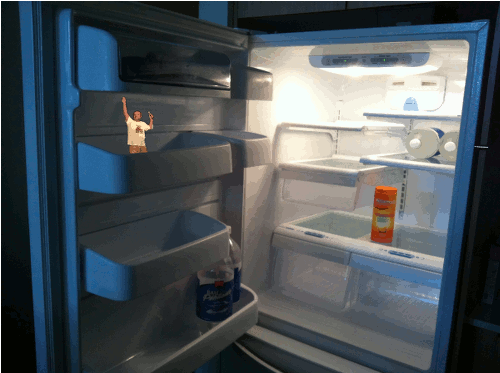


And what I’m talking about is that the colours get all pixelated. I didn’t have this issue with the GIFs I made during the #ds106zone—those were all black and white. That was a clue to what is going on…something with colours.
Why it happens (I think)
After numerous web searches last night, what I came up with as the cause is probably that the original images I’m using for the GIFs are in RGB colour, and GIFs have to be in indexed colour, at a maximum of 256 colours. So when the image is exported as a GIF, it reduces the colours and I get this.
The text on the Scottlo GIF is a different matter. I’m not certain what causes that, though maybe it has to do with anti-aliasing and semi-flattening, as discussed here? Ideas?
What can be done?
I don’t know. Any ideas? I thought at first maybe I was just out of luck because GIFs have to have smaller numbers of colours.
But that can’t be all there is to it, because other people have been making GIFs in colour and they look better. Sure, there’s still some of this pixelated colour stuff, but it seems not as bad, I think. See, for example, GIFs by Talky Tina, John Johnston, Rockylou, Andrew Forgrave.
So what are they doing that I’m not, besides using other programs than GIMP, and can I do in GIMP what they’re doing?
Or am I just being too picky about how my GIFs look? Entirely possible!
Thanks to any and all who have ideas. Much appreciated!
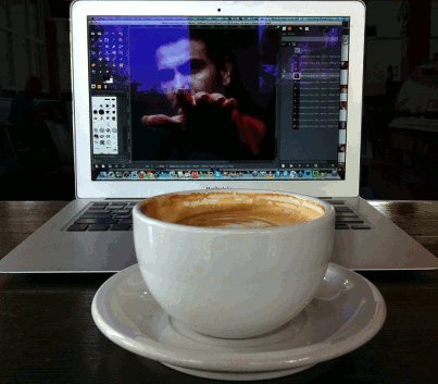
How I feel when I have too much coffee.
I was making this GIF this morning at a coffee shop while working on another GIF that I still have yet to finish. That one will be posted soon.
August Animated GIF challenge #11 is making a wiggle stereoscopic GIF. Seemed pretty easy—take a photo from two different angles and make a GIF so it wiggles. But this, like all digital storytelling, is an art. And I have a lot to learn. This one does not look like 3D like these sorts of things are supposed to. Rather, it looks like a jumping bunch of confusion.
I should have made the angles between the two images less—I should have taken the photos without moving so much in between. Lesson #1. I wanted the coffee cup to wiggle but not the computer so much. But the coffee cup wiggles too much and the keyboard of the computer wiggles too much too.
I should not have had a great deal of the cafe in the background, because what I wanted to stay fairly lined up was the computer screen, which meant that the background in the cafe moved a lot, which was really really annoyingly dizzy-i-fying. Lesson #2. What I did (in GIMP) to help with this was create new black layers on top of each of the two images, then create a layer mask with a selection so that the black layer showed only in the cafe part behind the computer. I reduced the opacity of the black layer to about 90%, then applied the layer masks to the black layers and merged them down onto the two original images. So now the background is blacked out a bit and it’s not quite as distracting. But I could have used more black than this, even. Maybe nearly full black, because the cafe movement is still distracting.
I should not have had a glare on the computer screen, because that moves too much with the two images as well. Lesson #3.
And why is my image so pixelated? Really…this has been happening with gifs a lot lately. Is it the gif format?
But it’s late and I need to go to bed, so, well, it is what it is for today.
Even though this did not turn out how I would have liked, I learned a lot, which is a good thing too. I want to make another one sometime that looks better, and then I’ll post it to the assignments bank as an example. This one…not so much an example of the right thing to do!
The GIF on my computer in the image is taking a little while because I have to do something to it layer by layer, which is kind of a pain but I hope it will turn out looking good as a result. Hopefully tomorrow or the next day that one will be done!
So in my last post I posted a GIF I had made, and said that I had tried doing it another way that I thought should work but didn’t. I’m hoping someone who knows GIMP can help me figure out why it didn’t.
Looking at the GIF that previous post is needed to understand this one.
I thought I should just have been able to put the clown image on the bottom of the layers, then put in the flower layers on top of that in the following way:
For each flower, have three layers at 25% opacity. This way, I thought, they would fade in, 25% at a time, up to 75% opacity. They’d be above the clown layer, so would just fade in one at a time on top of it. Each flower would come in after another had already come in, and the first would stay there.
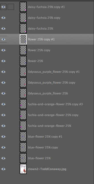
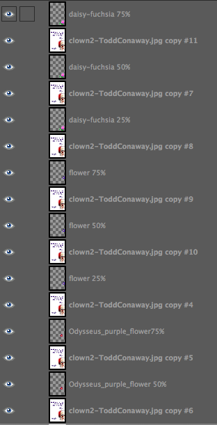
So I had my layers in GIMP like this.
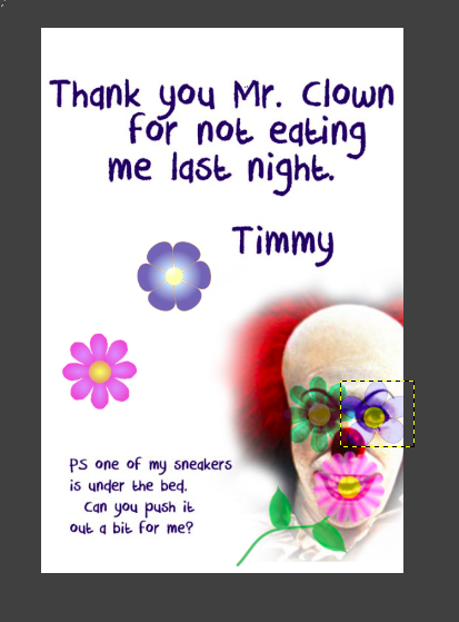
But when I did that, here’s what I got as the GIF.
Ummmm…where’s the fade in? And why are they 100% opacity at the end rather than 75% like they should be?
The even weirder thing is that what I saw on the screen in GIMP, with all the layers visible, before exporting this as GIF, was this:
The flowers are at a different opacity, and different colours because I had messed around with the layer modes for some of them.
So why didn’t the exported GIF have the same colours and opacities as the image on my screen in GIMP?
I spent a long time last night trying to figure this out, and then finally just went with the really long way of making this GIF, which is explained in the previous post.
I don’t get it. Can anyone help?
August 2013 Animated GIF challenge #8 is “Add some flower power!”
The idea is to make something not so nice look nicer by adding some flowers.
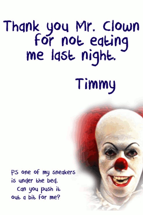
Todd Conaway made this scary picture the other day, for a thank-you note to a childhood fantasy character.
I thought this one could use some serious flowering.
So I made this. I think it takes some of the creepy out of him by covering his eyes and mouth with flowers. Right?

This actually took me MUCH longer than I had expected. I’ll note that in another post, because I would like some help with a particular question about why something I tried didn’t work.
What I did here:
I got the flower images from a site Talky Tina pointed to in her blog about this assignment: http://www.clker.com/search/flower/1
1. Duplicated flower images three times, adjusted opacity of each so 25%, 50%, 75%. Also played with the “layer mode” on GIMP of some of them to get funky colours (the two on the clown’s eyes).
2. Duplicated the original clown image to put under each of the first flower layers (the blue one on the left)—so a clown image under the 25% opacity of the flower, then one under the 50% and 75% opacities. Then merged down so had three layers of the clown image plus flower at different opacities. The idea of what I did is given in the screenshot below, even though it is for different flower layers. This is before merging down.
3. Duplicated three times the layer with the blue flower at 75% that had been merged with the clown image, and then put one of those under each of the next flower layers (the purple one at left, in 25, 50, 75% opacities). Merged down.
4. Repeat with other flower layers.
5. I duplicated the last flower layer (daisy on the clown’s mouth) several times, so the whole image with all the flowers would stay for a bit longer at the end. That worked fine until I “optimized animation for GIF” in GIMP (Filters->animation->optimize for GIF). I didn’t do that at first, but then the image was too big to animate on Tumblr. Seems it needs to be less than 1MB to animate. Optimizing it makes it MUCH smaller (this one is just over 140 KB), but it got rid of the duplicate layers at the end, so the image with all the flowers didn’t stay very long. What it did was add “combined” to each layer, though I don’t know what that means. So to fix this, I after optimizing I just duplicated the last layer a few times again. Worked like a charm.
6. I don’t like how GIMP has been making the GIFs look all pixelated. This is probably due to the optimization stuff, and/or the GIF format? Yes? No?
I wanted to have the flowers fade back out again like they faded in, but by the time I got this far, I had spent way more hours than I had planned, and decided this was good enough.
I tried what seemed to me a much easier way of doing this, but it wouldn’t work like I thought it should. Next post: please help me figure out why that didn’t work!