Taking my giant cat West

The ds106 daily create for February 19, 2016 was:

But I decided in the end to just use one cat (less work to cut one out of its background than two). I thought I might have to put the cat in the back of a pickup truck with the back door up, so I thought the one of Marco standing up would be better because more of him would be out of the truck bed.

I first tried to put him into this truck:

From pixabay.com, public domain

But when I made him into a giant cat, and put him high enough in the truck behind the back gate so you could see he was a cat, there wasn’t enough room for his head.

Then I found this image on Flickr:

SAAB 99 pickup truck, Flickr photo by John Lloyd, licensed CC BY 2.0

Perfect–I wouldn’t have to put him inside the truck back door, which would require cutting the door out of the image and putting it on a new layer, on top of the cat!

Process steps (using GIMP)

  1. I opened both images (truck and cat) as layers.
  2. Then I used control-click (right-click) on the cat layer and chose “add alpha channel,” which allows it to be transparent if you erase part of it.
  3. Time for the eraser tool on the cat layer:

Screen Shot 2016-02-20 at 8.54.57 PM

4. After working with the eraser in smaller increments, I ended up with this:

Screen Shot 2016-02-20 at 9.30.26 PM


I just wasn’t really thrilled with the result. For one thing, it looked like he was listing to the side a bit.

5. I then went to Layer on the top menu and chose Transform -> arbitrary rotation and rotated him a bit so he wasn’t listing so much. But it still looked weird.

6. He needs a cat bed or a pillow, I thought. Otherwise it just looks like he’s sitting strangely on that truck. I found a picture of a pillow on Pixabay. I did the same as in step 2 to add an alpha channel to the pillow layer, and used the eraser tool to get rid of the white background.

7. But the pillow was sitting at a weird angle; it looked like it wasn’t really sitting flat on the truck. This time I used the perspective tool on the left menu of GIMP and moved the layer around with different perspectives until it looked better.

8. I then cleaned up the edges of the cat a bit more. I realized that if you make the eraser tool Screen Shot 2016-02-20 at 10.10.14 PMbigger, using the brush that looks like the one with a square around it on the right, it will give you softer edges on your erasing around the image (rather than using a smaller brush, which gives harder edges).


And so, the finished product:

GiantCatGoingWest


Amazing how he can manage to stay on through all the bumps in the road!


Captioning Frederic Remington

I had hoped to participate in the Western-themed #ds106 this term, and what with teaching a little less than usual I thought I’d have time. Not. Too many grant applications, research, award applications, and lots and lots of committee work. Alas.

But I did do today’s Western-themed #ds106 Daily Create: caption a Frederic Remington painting. The instructions were to “add a caption to the painting to bring the west into the modern age. Make it funny (yet stay respectful).” Well, not sure I brought it into the modern age, but I did try for the rest of those instructions.

Remington-YouDidntJustDrinkThat

The original is “Miners Prospecting,” public domain on Wikimedia Commons.

The one with the pan just looked so guilty…


I used GIMP to add the text to the image. I didn’t have any fonts that looked Western-y enough, so I went to dafont.com and downloaded “Duality.” I felt like it mixed oldish-looking with a kind of sense of joking fun.

Every time I do this I forget how to add fonts to my computer so GIMP can use them. Fortunately, there’s the internet. This page was helpful.

The hardest part was picking a colour for the text that made it stand out and be readable, and yet didn’t just sort of fade into the picture as if it were part of it. The yellowish colour worked best, as it fit the aesthetic of the image better than like blue or something, yet also clearly looks added on (which was the idea!).

Vote philosophy!

The leadership at #prisoner106 has disappeared. Number 2 hasn’t been seen for a couple of weeks. My Super True Friend I am Talky Tina filled in for a week, but now it seems to be a free for all. Participants are still making art, though, because we are #4life.

During one of the recent weeks we were to make a campaign video to run for Number 2’s spot (playing off the “Free for All” episode of The Prisoner). 

I developed an idea for one and started working on it (I made my campaign button), but then . . . I found a way out! I escaped for a week. I’m still not sure how . . . I was out for a swim, flagged down a passing boat, and managed to get away with them. Rover didn’t come after me; maybe the disarray at the top in the Village means Rover is taking a break too.

I’m not sure where we went; I just know there were glaciers! I snapped a couple of pics.


IMG_1555

It was a lovely time away, but then they turned on me! I woke up a week later, back in the Village. Someone must still be in charge, somewhere.


When I got back I was even more determined to run for office. We need someone who won’t just follow orders, who will ask questions and demand answers. Who better than a philosopher?

VoteVillagePhilosopher

The process

I used the poster design from the “Free for All” episode, adding a couple of new elements such as the button and the tag line at the bottom.

I made this using GIMP.

1. I had the head shot already from the Village information card I made during week 1. I just copied and pasted that layer onto a new image with a white background.

2. I used the Filters menu, chose Distort (I think) and then Noise Generator to add some noise to the image. I wanted it to looks a little like it had been badly photocopied and blown up. I also used the smudge tool on my hair because the edges were too stark.

3. I used the eraser tool with a “smoke” brush to do the effect of the image fading out at the bottom and on the left side (this is what the images on the posters in the episode looked like, approximately). I also did some erasing at the top of the image.

4. I added a layer with the button I made earlier.

5. Then it was just text layers with the Village font and finis.

Village Philosopher Badge

This week in #prisoner106 we are to make a campaign video for running for office (the position of Number 2 seems to be unoccupied right now).

In preparation for campaigning I created a special badge for the Village Philosopher–that’s me! I need a special way to identify myself so you know whom to vote for.

I am not a number, I am a … Greek letter.

VillagePhilosopherButtonBeveled

The process

I made this in GIMP.

1. Images used, each on separate layer:

2. Scale and order layers so the phi is on top of the penny farthing. I had it under the penny farthing for awhile and was scratching my head trying to figure out how to get the Phi image to not be transparent because the wheel spokes were showing through. Oh my gosh…unbelievable…complete brain freeze not realizing it was just a matter of layer order. Yikes.

3. Add a white background layer under both image layers. Add alpha channel to that layer. Use the ellipse select tool to select a circle on the white background layer, then go to Select->invert to select everything but the circle.

4. Go to Edit -> clear to get rid of the white stuff outside the selected circle on the white layer.

5. Add bevel. Use ellipse select tool to select around the white circle on the background layer (the following will only work if something is selected, I think).

  • Use filters -> decor -> add bevel
  • I used the max size for the bevel, 30px

Done!


Issues

1. When I uploaded to Flickr it had a red background:
The Village Philosopher

This was very puzzling, until I learned that when an image has a transparent background, not all file types will preserve that. png does (what I saved it as), but jpeg doesn’t. Not sure what happens on Flickr, but it doesn’t show the original image in the view window. The red disappears if you go to the Flickr page and download “original.”

2. I couldn’t get the bevel to look as nice as the one on the badge on the right side of this site. There is a way to make a bevel manually, but it’s more complicated. This auto-bevel script has little in the way of customizing choices. I think there might be another GIMP script that has more.

3. I don’t know why the bevel only shows up on the right and bottom sides. Must be something built into the script?


Update

I tried playing with the “light and shadow” filter on GIMP, and got this one. Still not sure what to do to make the top left look like it’s standing out a bit from the background.

VillagePhilosopherButtonBeveledShadow

Pennyfarthing Drive

Pennyfarthing Drive

When I was out doing my design blitz in the Village the other day I discovered that there is a street called Pennyfarthing Drive in the Village. Well, of course there is.


Alternate version

I also did a red version. I’m not sure which I like better.

PennyfarthingDr


the process

This is really a “visual assignment” (last week) rather than a “design assignment” (this week), but oh well.

This was a problematic image to work with because it was not very light in the laneway where I took it, and there wasn’t much daylight left in the day. So the street sign didn’t stand out at all. I wanted to find some way to emphasize the sign.

First, I discovered the “burn” tool in GIMP (in the tool pane) and tried it out. I didn’t know what it did. On this b/w image it lightened things up. So I used it on the words on the sign, to brighten them.

Then, I decided to do a colour splash. This was a little tricky because I wanted two different colours, one for the sign and one for the lamp.

1. First, I duplicated the image a couple of times.

2. I added an alpha channel to the layer with the b/w image, and then used the “lasso” tool to select around the sign and then the lamp. I used Edit -> clear to delete the selection, leaving a transparent spot for each.

Screen Shot 2015-07-26 at 10.54.24 PM3. I had two other layers with the same image. On one of them I used Colors -> colorize to colour it green, and I did the same on the other to colour it yellow. Only I discovered something: I had the lamp still selected on the yellow layer, and when I did “colorize” it just coloured the lamp, not the rest of the image. Interesting.

4. On the yellow layer I selected around the sign and did the same thing as in step 2 to make the sign on the yellow layer also transparent. That way it would show through to the green layer below it rather than showing the sign yellow.

Screen Shot 2015-07-26 at 11.00.07 PM

Here’s a screenshot of the layers; the b/w on top, the yellow lamp, then the layer that got colorized entirely green.

Screen Shot 2015-07-26 at 11.00.43 PM


Design Blitz in the Village

It’s design week for #prisoner106, which means time to take pictures that exemplify design principles. We were to take images of things that show at least five of the following:

Screen Shot 2015-07-26 at 10.07.40 PM

A nice set of resources on these design principles can be found here.

I’ve done a couple of design blitzes before; one was in Fall 2013 and another in Spring 2014 (that one is on the site with my teaching and learning portfolio; I should put it somewhere else because now that site just has my portfolio on it).

I really enjoy doing these because it helps me understand these design principles, and it’s just darn fun! But I was really busy this week finishing that teaching and learning portfolio (it was due this week for promotion, and now I leave it alone for a year until I find out if I’ll be able to move up to the next faculty level). So I didn’t get as much done on this assignment as I wanted.


Color

IMG_1509I was drawn to the use of colour in this sign for a couple of reasons. One, because I think it’s used effectively to draw your eye to the titles of the different sections, and to separate out the elements in the image on the far right. But I also like it because it works on another level: it’s about water (blue) and how to deal with it in an environmentally friendly way (green).

IMG_1510

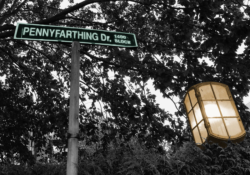
I think this is a questionable use of colour in the words. When I put some type in different colour than other type it’s b/c I’m trying to emphasize something, to focus people in on some parts of the text rather than others. Here, I can’t tell what I’m supposed to be focused on. The white seems to stand out more, but could it really be that they want me to pay most attention to “your grocery list”?


Typography

IMG_1506

The typography here struck me because it’s clearly trying to hearken back in time, but then when you look at the “established” date it’s just five years ago. There’s something interesting in that juxtaposition. At any rate, they’ve managed to capture a retro feel with the typography and the arrows around “distillery.” the wrought iron holding the sign helps too.


Minimalism/use of space

IMG_1501

How much more minimal can you get? And yet, this is very effective. This place is tucked away in a part of campus not a lot of people go to, on the ground floor of a residence building. I think it’s pretty effective to let people know quickly and easily what can be found there. Once you get a bit closer you can see the name of the place (sign on the top left), but really, “food” and “coffee” are the most important messages.


Balance

IMG_1514

I see this design all over Vancouver, especially at bus stops. Usually there is some kind of roof that stops the rain, but this one doesn’t have a roof…not sure what the point is, then.

This seemed to me to be an interesting example of balance–it should feel off-balance, because the right side is much longer than the left. But it still feels balanced, to me. There’s probably some complicated mathematical or physical principle for why it’s not heavier on the right than the left (or maybe it is?). At any rate, I like this example of a not-balanced balance.


Form and function

IMG_1497

I don’t know if this really counts under the “form and function” header; this is a picture of a new earth sciences building on the campus where I work. On the bottom are panels of different sorts of stone, all labeled with the kind of stone they are and where the stone came from. It’s a building devoted to education that is itself educational.


Metaphors/symbols

IMG_1499The University of British Columbia is celebrating its centennial year in 2015-2016. I think this design nicely captures both the past and the future, even if the suggestion that UBC will live on infinitely is rather far-fetched.

IMG_1500

This sign is near some apple trees that are nicely placed on campus where one might want to just take an apple and eat it. I like that they’ve put on the sign a suggestion that you wouldn’t want to eat the fruit anyway b/c it’s full of worms. That’s maybe not what they intended but it’s a message one could get even unconsciously, perhaps.


A collection of Cannabis dispensary signs

I found one, then another, then another within a short space. Two were on the same block. I took the image of the first one b/c it seemed a good use of a symbol:

IMG_1512

The small plus sign on the left is a subtle connection of this establishment with medicine (as is the word “dispensary,” but that is already commonly used for these businesses). Putting it in green fits with the fact that this about a plant. And the large font for “CANNABIS” plus the smaller font for “dispensary” seems designed to catch the eye (it did mine). Of course, using “cannabis” rather than “marijuana” also indicates a more official, medical purpose.

IMG_1515

This one also uses the green plus sign as a symbol, along with the word “clinic,” which clearly brings up the idea of medicine.

IMG_1517

And what says “medicine” more than an image of a doctor with a stethoscope? And a sort of clever attempt at connecting “Canada” to “cannabis” in the name of this place. But why does it matter if we get the impression that it’s Canada-wide? (I have no idea if it is.) Maybe it seems more legit?

Also, this was the third one in just a few blocks and I was starting to take pictures of them just b/c it was funny after awhile to see so many ….