Nordic cat

The #ds106 daily create for June 10 was: “What are the Nordic Ministers summoning? A mythological creature? A weather related phenomena? Some force we can only imagine in dreams? Create, draw, write a story of what these people are calling up from the seas…”

Here is the original photo from a tweet by @TVMaury:

Ministers of Nordic countries standing in a circle with their hands on a soccer ball in the middle


And here is what I made. They just all wanted to pet the cat! But the cat isn’t so sure about it.


I wanted to think that with all the political shit stuff going on in the world lately we could all just be happy petting a cute animal. And then I thought–well, the cute animal may not be that happy with so many people holding it, and this pic of a cat fit that idea I thought … its eyes signal to me: “I’m really not okay with this but I will stay still and hope it’s over soon.” Or maybe: “I am burning this into my memory and you will feel my wrath someday. Not yet, but someday.”


Actually, the cat one is the second one I made. At first I tried with a hedgehog, but it just looked weird because the fingers in the front were covering its face so I had to get rid of some of them otherwise you couldn’t see its face. But then it just ended up odd:

I told myself maybe it could look like their fingers were in its fur but really, that just wasn’t what it looked like.


Process

I followed the same procedure for both of these. I put the two images into GIMP, with the animal one below the ministers one, and I used the eraser tool on the ministers one (after adding an alpha channel to it to allow it to be transparent underneath) and erased the portions where I wanted the animal picture to show through.

This was made easier by increasing the transparency of the ministers picture so I could better see the animal picture below it while erasing. I also had to scale the animal pictures so they were a realistic size.

The hardest part was finding good source material. The pictures of the animals had to be such that they would “fit” into the hands in a good way, or at least so I could erase parts of the hands and not have it look weird.

I used these two pictures licensed CC0 from pixabay.com

Cat picture

Hedgehog picture


Catching up on some daily creates

June 2017 is the 30 day challenge for ds106 daily creates. I did a few this week that aren’t already on this blog.

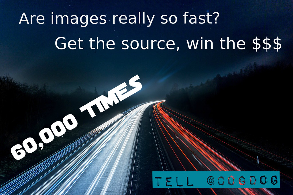
For June 5, the daily create prompt was to goad people at the NMC conference into finding out the source of the dubious claim that we process images 60,000 times faster than text. See Alan Levine’s blog post about this for more info.

I really struggled with this one. At first I wanted to make an infographic about the claim, the need to substantiate it, etc., and I checked out Piktochart which looks cool…but it was just taking me too long and it was late at night and I was tired. So I downloaded a CC0 picture from pixabay.com and added some text with pixlr.com.

60000 times faster?


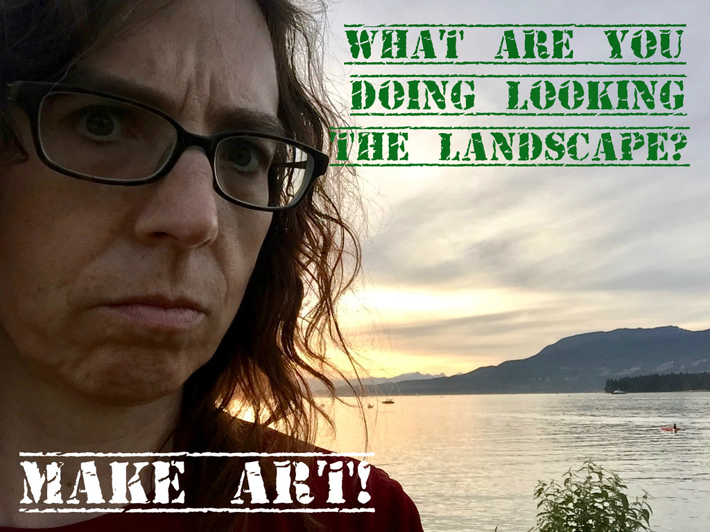
For June 6 the prompt was: “Give us your toughest Sergeant Hulka face in a selfie.”

I also used pixlr to add text to the image on this one.

Sgt. Hulka says make art dammit!

June 7th’s daily create prompt was to put a latte in a ridiculous container like the Avolatte. I spent a year in Melbourne, Australia, and I loved both lattes and avos there, but I am glad I wasn’t there when that amalgam came around.

This prompt inspired me to use an image of Brussels Sprouts in a cup that I had used for the Networked Narratives course I popped into for about a week.

This one I did completely in GIMP. I found a picture of a latte on unsplash.com and added text with GIMP. I used the eraser tool on the latte image to just get the coffee part (added an alpha channel to the layer first).

Then, the only tricky part wass that I had to add the block of semi-transparent darkness behind the text at the bottom, and I couldn’t quite figure out how to do it. I tried selecting it and then using the colour bucket tool, but that did a weird thing where it filled different parts of the image differently. Then I remembered I should have done it on a new layer anyway so I could change the transparency, so I made a new layer and just used the paintbrush tool to paint inside the selected area (wow, GIMP just automatically paints inside the lines of the selection when you do that on a layer with a selection!). Then adjusted the transparency of the layer so it wasn’t entirely opaque.

Sprout-a-latte

Latte image by Frankie on Unsplash.com: frankie

Finally, the June 8 daily create asked us to get Obama to say something through Talk Obama to Me: “Can you get hime to recite a song lyric, a short poem, or just an affirmation of how good it is to do Daily Create?”

Since I was/am behind on my daily creates, and wanted to know if I could still get my Creatorist badge from Talky Tina even if I’m behind but I still do them all, I decided to have Obama reassure me:

screen shot of what I had Obama say through the Talk Obama to Me app

And here he is saying it!


Now it’s getting late again and I’m still one day behind, but I’ll try to catch up by doing two tomorrow!

Head in the stars, on the ground

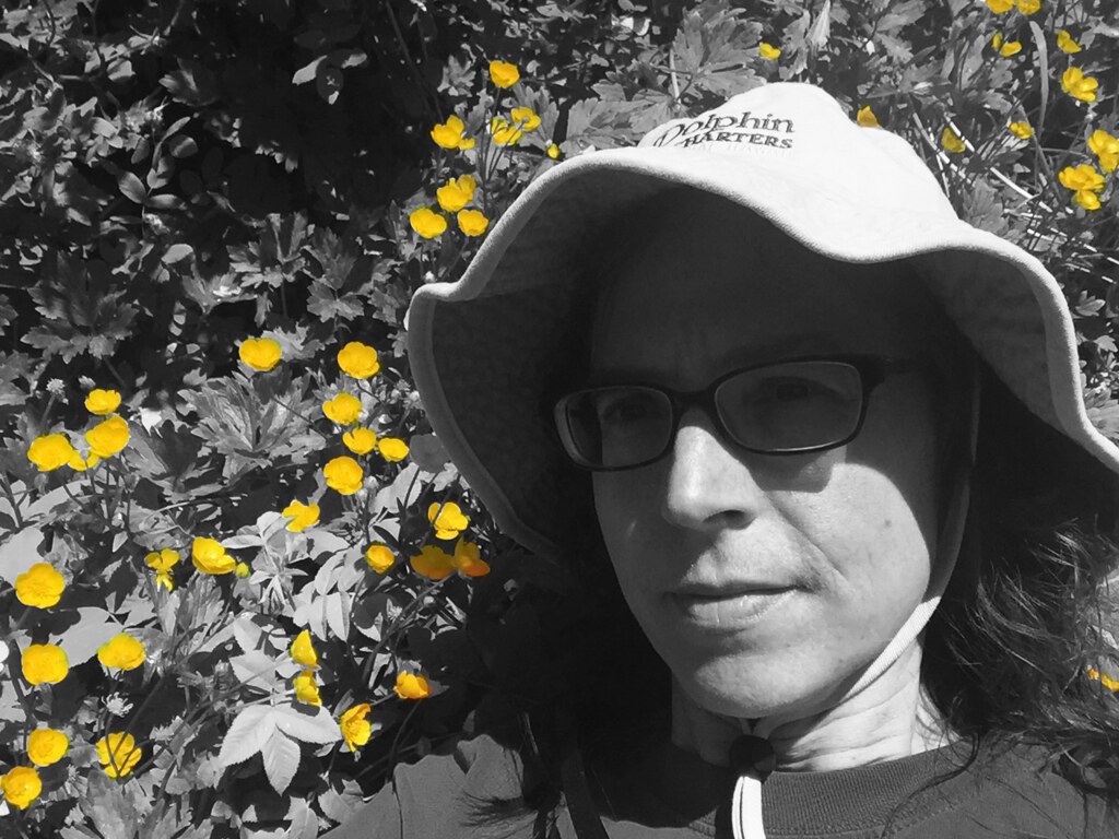
The #ds106 Daily Create for June 4: “Show us that your feet are on the ground, or that your head is in the sky. Or visa-versa for that matter. Or both if you can?”

Here is what I did for this one:
Head in the stars, on the ground

Process

I used GIMP and made two copies of the same image.

For the one on the top layer I desaturated it (under the “color” menu), and played with the “curves” controls under the “color” menu to get the kind of light and dark I wanted (or rather, I played around until it looked okay, not perfect…I didn’t have much time to spend on this one).

I also added an alpha channel to the b/w image, so that it would be transparent when I erased parts of it. I right-clicked on the layer in the layers dialogue on the right, and picked “add alpha channel.”

Then I used the eraser tool and erased where the yellow flowers were. The image on top was b/w and the one on the next layer was in colour so when I erased parts of the one on top, the image on the bottom showed through.


ASCII art on the beach

I was at a conference the last few days, but managed to get a couple of daily creates in for the June 2017 daily create challenge–do 30 daily creates in June! Well, I was late with one of the first two, and will be late with today’s too…that will come tomorrow. But I plan to do all 30 even if not on the right days!

Since I did the creates for June 1 and 2 on the same day, I ended up combining them.

The daily create for June 1 was:

Make this uncreative skinny kid a blossoming portrait of creative prowess! Show us your creative muscle, your photographic bicep, your video burpee (for the love of our eyes, do not take this literally, think metaphorically!)

Image provided at daily create site for June 1, 2017 (linked above)

For June 2, the daily create was: “Take your own portrait rendered in ASCII Art (image made of text characters). Try the ASCII camera.”

Here is my ASCII selfie:

I took a few, and used this one because it didn’t have any background and so could look better in the image below, as if it were on a computer screen (I managed the white background by standing in a bright patch of sunlight against a white wall).

And here is what I made combining both daily creates:

Process!

Well, the ASCII selfie was easy with the ASCII camera linked to in the June 2 daily create.

Here is what I did in GIMP to make the two panel comic above.

  1. I opened the original image in the June 1 daily create and got rid of the text in the speech bubble:

I did this by using a paintbrush with white to colour over the text from the original image.

2. I made a copy of this new image with no text so I had two layers in GIMP that both had this same image.

3. In the first version of this image I made my own text, which is in the left panel of the two panel comic above. I used the text tool, which creates a new “text layer.” Comic sans seemed the right font choice!

4. In the second version of the image that I created in step 2, on a second layer, I “erased” the two guys. For the parts of them that had a white background I painted over them in white like in step 1.

For the parts of them that were in front of another background like the water or the beach ball, I used the “clone” tool to cover them with something that resembled those backgrounds. I ended up getting rid of the umbrella, because it looked weird sitting there all by itself on the right, with no bottom part to it.

The beach ball was hard to do with the clone tool … I couldn’t get it very round. And then I just gave up after awhile b/c it was good enough and this is the daily create and I was already spending too much time on it!

4. I found an icon of a computer on The Noun Project. I purchased a subscription to the site so I don’t have to pay for icons individually, though you can use icons for free with attribution. I used the Mac app to find the icon which doesn’t allow me to easily find a link to it on the web. Not so good for sharing with others, sorry. I used “open as layer” to add it to the image in GIMP.

5. I had to paint white into the middle of the computer icon b/c icons have a transparent background when you download them from Noun Project.

6. I used the transform tool in GIMP to change the perspective of the computer so it looked a little like it was facing the woman.

7. I opened the ASCII selfie pic “as layer” and also used the transform tool to make it fit onto the computer screen.

8. I drew my own speech bubble on the second panel (as you can tell…it looks kinda not so great but whatever) and added text.


All told, this probably took me an hour rather than 15 minutes per daily create. But it was fun!


Planning to do two again tomorrow…

Not quite #ds106

Not Quite #DS106


DS106 Daily Create for June 2, 2016: You look for a representation of DS106 in the world, and you find something close, but not quite it. Find something like that. (You had one ds106 job!).

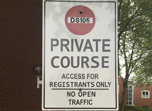
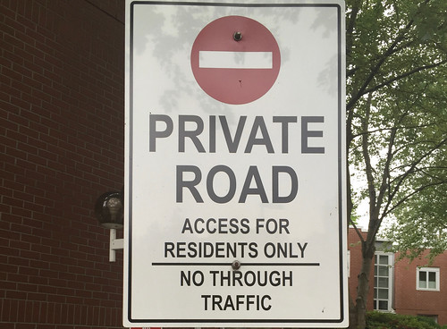
I went for a walk yesterday while thinking about what to do for this daily create, and came across the following sign:Private road

That’s when it hit me: there are many, many things I love about #ds106:

  • the amazing people in the community!
  • the amazing learning opportunities that I’ve had that allow me to create art
  • the amazing people in the community that helped me to get over my fear that I wasn’t any good at art
  • the laughs, the supportive comments, the fun…yeah, you get it…the people!

And it is all possible because DS106 is an open course. People who are not officially registered in it can still see what’s going on with those who are, can see what they create, can engage with them and with those who are not officially registered and are doing it as “open” participants. I have learned so much and met so many wonderful people (many of whom I haven’t actually met in person but feel like I have), and this would not have been possible if it hadn’t been available to “open traffic.”

So I decided to create an image that says: you can get close, but not quite it if it’s not open.

My original image was pretty wise-ass, substituting “BS” for “DS” (as in, you know, bull****).


But I thought, well, sometimes it might be important to run a ds106-like course but keep it closed, only for registrants (and I thought of someone I know who did just that). And I decided I was being too nasty with my “BS,” b/c such a course wouldn’t really be “B.S.”

So I changed it to more like “close but not quite” as DS105. Almost there.


The process

I did this in GIMP. That’s what I first learned on in ds106, and it’s still my first love. I have access to photoshop now through my job, but I haven’t taken the time to work with it. And I can still do all I want (so far!) in GIMP.

  1. Upload original image and add “DS105” to the top, inside the red circle. I searched for a font on dafont.com that looked somewhat like the DS106 logo, but it was okay if it didn’t really fit b/c, well, this was not quite it! I used “Plane Crash.”
  2. Use “clone” tool to erase the “Road” under “Private.” This image worked really well for this sort of thing, because there was so much white space I could use to clone.
  3. Find a font that looks pretty close to the font used for “Private” and add “Course” where “Road” was. Here I started by just looking through the fonts I already have installed. Font Book on the Mac lets you easily flip through them and see what they look like, so I just did the tedious thing of going through a bunch of fonts and seeing what matched more or less. The Consolas font did well.
  4. Adjust the colour of the new text “Course” to match the colour of “Private.”
  5. Adding the “Registrants” instead of “Residents,” and “Open” instead of “Traffic” at the very bottom were a bit trickier. I wanted to move the original text so that it fit better on the sign with the new text (when I tried to add “Registrants” in the place of “Residents” it didn’t fit in the space well without moving “only”).
    1. Duplicate the sign image so you have two (as per the screen shot below)Screen Shot 2016-06-03 at 11.20.56 PM
    2. Use clone tool on both the first and second sign images to erase the words you don’t want: here, I erased “residents” and “through” on both images, because those were the words I was going to replace.
    3. Add “alpha channel” to sign image second from the bottom–this means that if you cut anything out of it, the space where you cut will be transparent and it will show through to the layer underneath.
    4. Add text to original image (not the copy of it on the bottom of the stack)–“Registrants” and “Open.” I used the Consolas font for this too, even though it didn’t quite fit as well for this section of the sign as for the section above it, but it’s pretty close.
    5. Move this text you’ve just created to where you want it.
    6. Select around the original text you want to move, on the layer just above the last layer (here, “only” and “no”) and use Edit -> Cut, then paste and it will give you a floating text layer that you can move around. Move the word where you want, and it’s fine because where it was just shows through as transparent to the white space on the image at the bottom, where the clone tool erased the original word. See the screen shot below, which is hiding the image on the bottom of the stack to show the transparency where I moved “only” and “no.”
    7. Screen Shot 2016-06-03 at 11.27.46 PMAdjust the colour of the new words to match the originals as best you can.
  6. The much easier way to do the “registrants” and “open” words would have been to just clone out the whole of “residents only” and “no through” and re-type them in the new font and move them around from there. But of course, I only thought about that after I thought: hey, I know how to preserve as much of the original as possible and just move it. I think the effect would have been just as good to just add new text there rather than trying to keep some of the original and move it.


I like how this one turned out, and it was fun and pretty easy to do!

Where is Shakespeare’s head?

Vader-ShakespeareSkull-dailycreate-April2016
This image is on Flickr, here


The #ds106 daily create for April 23, 2016: It’s Shakespeare’s birthday! “Scientists have scanned Shakespeare’s grave and determined that his head is likely missing! Your mission – show us where Shakespeare’s head is!”

When I saw this daily create I immediately thought of an old #GIFfight from 2013, which used this Vader image. Then I used that image for another daily create in December 2013.

This Vader pose just reminded me of those old iconic images of Hamlet saying “Alas, poor Yorick. I knew him well ….”

I followed pretty much the same process as described in this blog post, including doing a transformation of the skull so it looked more like it was facing Vader.

Skull image is from here: www.publicdomainpictures.net/view-image.php?image=50580&